产品展示
界面稿
角色设定
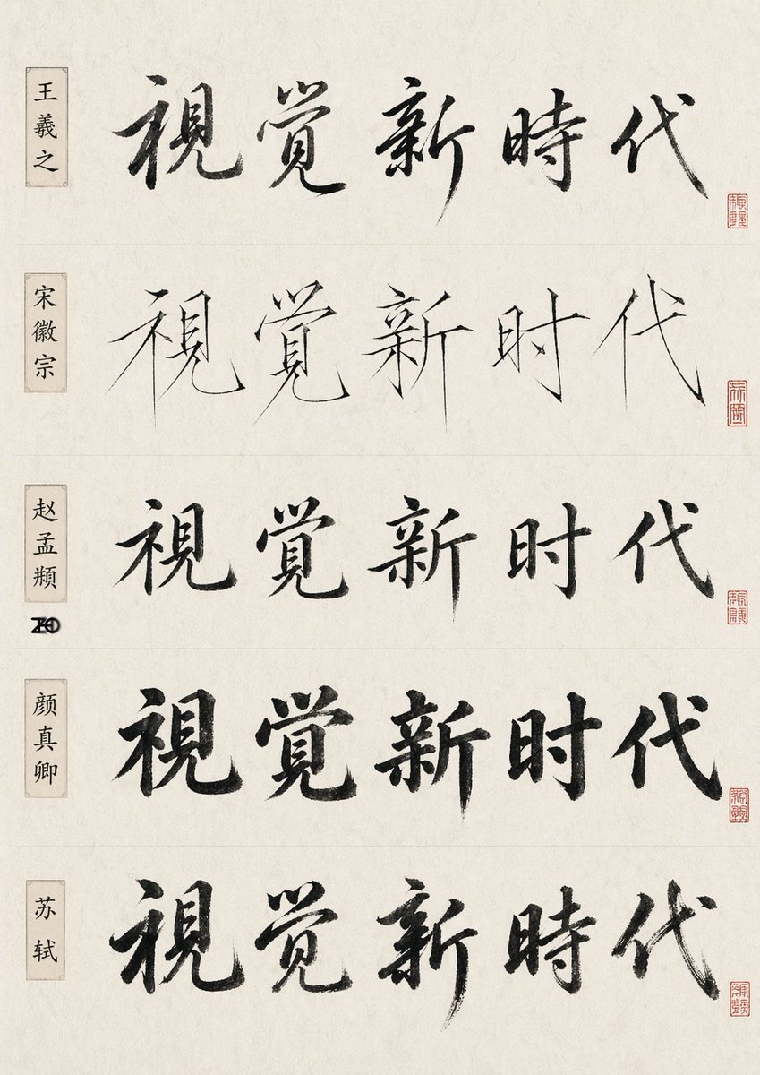
产品视觉 GPT Image 2 提示词:Chinese Calligraphy Style Comparison
A scholarly poster showing one Chinese phrase rendered in five historic calligraphy styles, useful for testing AI brush lettering and style emulation.
📝 提示词
{"type":"Chinese calligraphy comparison sheet","subject":"the same five-character phrase written in five famous-calligrapher-inspired styles","text":{"main phrase":"视觉新时代"},"style":"minimal scholarly presentation, off-white rice paper texture, black ink brush calligraphy, subtle fiber grain, clean museum-reference layout","layout":{"orientation":"vertical poster","sections":[{"title":"王羲之","position":"top row, left label box","count":1,"labels":["视觉新时代"],"calligraphy style":"flowing semi-cursive, expressive ink variation, elegant and rhythmic brushwork"},{"title":"宋徽宗","position":"second row, left label box","count":1,"labels":["视觉新时代"],"calligraphy style":"very thin and sharp slender strokes, Song Huizong inspired 'slender gold' aesthetic, refined angular lines"},{"title":"赵孟頫","position":"third row, left label box","count":1,"labels":["视觉新时代"],"calligraphy style":"balanced regular-script influence with soft rounded transitions and controlled structure"},{"title":"颜真卿","position":"fourth row, left label box","count":1,"labels":["视觉新时代"],"calligraphy style":"bold heavy brushwork, upright dignified structure, thick ink-rich strokes"},{"title":"苏轼","position":"bottom row, left label box","count":1,"labels":["视觉新时代"],"calligraphy style":"free spirited running script, robust brush pressure, energetic literati feeling"}],"row count":5,"repeated phrase count":5,"left label count":5,"seal count":5},"details":{"left labels":"each row has a narrow vertical beige name cartouche with black Chinese characters","seals":"each row has one small red square seal near the lower right end of the calligraphy line, all slightly different","dividers":"faint horizontal divider lines separate the five rows","margins":"wide clean margins, centered composition","background":"warm ivory xuan paper with subtle aging and natural paper mottling"},"quality":"high-resolution print-like study sheet, authentic ink bleed and dry-brush texture, restrained elegant lighting, no extra decoration","parameters":{"main phrase":"{argument name="phrase text" default="视觉新时代"}","paper tone":"{argument name="paper tone" default="warm ivory"}","ink color":"{argument name="ink color" default="black"}"}}
🎯 适合场景
适合快速搭建产品图、包装展示和品牌海报:主体、材质、背景与商业修图方向已经有框架,换掉变量就能开跑。
💡 改写建议
- 先替换变量里的品类、人物、城市、品牌色,不急着改整段结构。 把主体、构图和风格分开写,后续微调会更稳。