产品展示
界面稿
教育科普
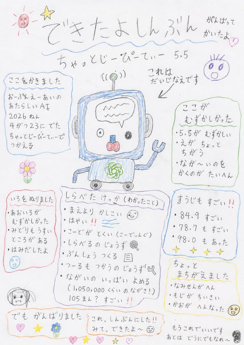
产品视觉 GPT Image 2 提示词:Hand-drawn Kindergarten Newspaper
A creative prompt to generate an image that mimics a 'children's newspaper' drawn by a preschooler using crayons and pencils. It emphasizes charming imperfections, messy lines, and uneven text for an authentic look.
📝 提示词
Please make the results of the research on {argument name="topic" default="AI assistant 5.5"} look like a 'children's newspaper' made by a preschooler. It should look like it was drawn on white paper using colored pencils and lead pencils. It is a newspaper, but not a proper one. A child worked hard to make it look like a newspaper. In the center, there is a poorly drawn picture that tried to copy an original image. Please do not make it a clean picture. Do not make it a good drawing. Do not make it cute or tidy. Do not make it a skillful child-style illustration. Please make it look like a truly bad drawing that a kindergartner would make. Please make the title look like it was written by a child. Use a strange title at the top like '{argument name="title" default="I Made a Newspaper"}', 'I worked hard on this', or 'This is an important drawing'. The text should be mostly hiragana. The sizes of the letters should be inconsistent. They should not be lined up straight. They should be slightly tilted. Sometimes a letter is too big, sometimes too small. Inside the newspaper, there are poorly written headings. They should say things like '{argument name="heading" default="I wrote this part"}', 'This part was hard', 'I colored it in', 'I made a small mistake', or 'But I did my best'. The lines should be wiggly. Square boxes should not be straight. Circled parts should be weird ovals. Arrows should point in strange directions. It was meant to mimic an original image, but it didn't turn out well at all. Shapes are not proper. Sizes are inconsistent. Large parts are too big, small parts are too small. Eyes, mouths, or bodies are in slightly weird places. The placement is shifted. Something is just a bit off. Colors should bleed out of the lines. There should be uncolored spots. Some areas are colored heavily, others lightly. There should be visible marks from scrubbing hard with colored pencils. In the corner of the newspaper, there should be small, poorly drawn pictures like a sun, star, flower, heart, a weird face, or unidentifiable circles. But please do not make it clean. Do not organize the layout. Do not make it look like professional design. Do not make it like a professional newspaper or a well-done classroom newsletter. Make it look like a child is showing it to you, saying, 'I made this into a newspaper!' or 'Look, I finished it!'. It is a bit bad. Quite bad. The writing is bad. The drawing is bad. The boxes are bad. But the child worked hard to make it. The background is just plain white paper. Finally, just let it be since they worked hard on it. Let the rest happen as it may.
🎯 适合场景
适合快速搭建产品图、包装展示和品牌海报:主体、材质、背景与商业修图方向已经有框架,换掉变量就能开跑。
💡 改写建议
- 先替换变量里的品类、人物、城市、品牌色,不急着改整段结构。 把主体、构图和风格分开写,后续微调会更稳。