产品展示
界面稿
社媒配图
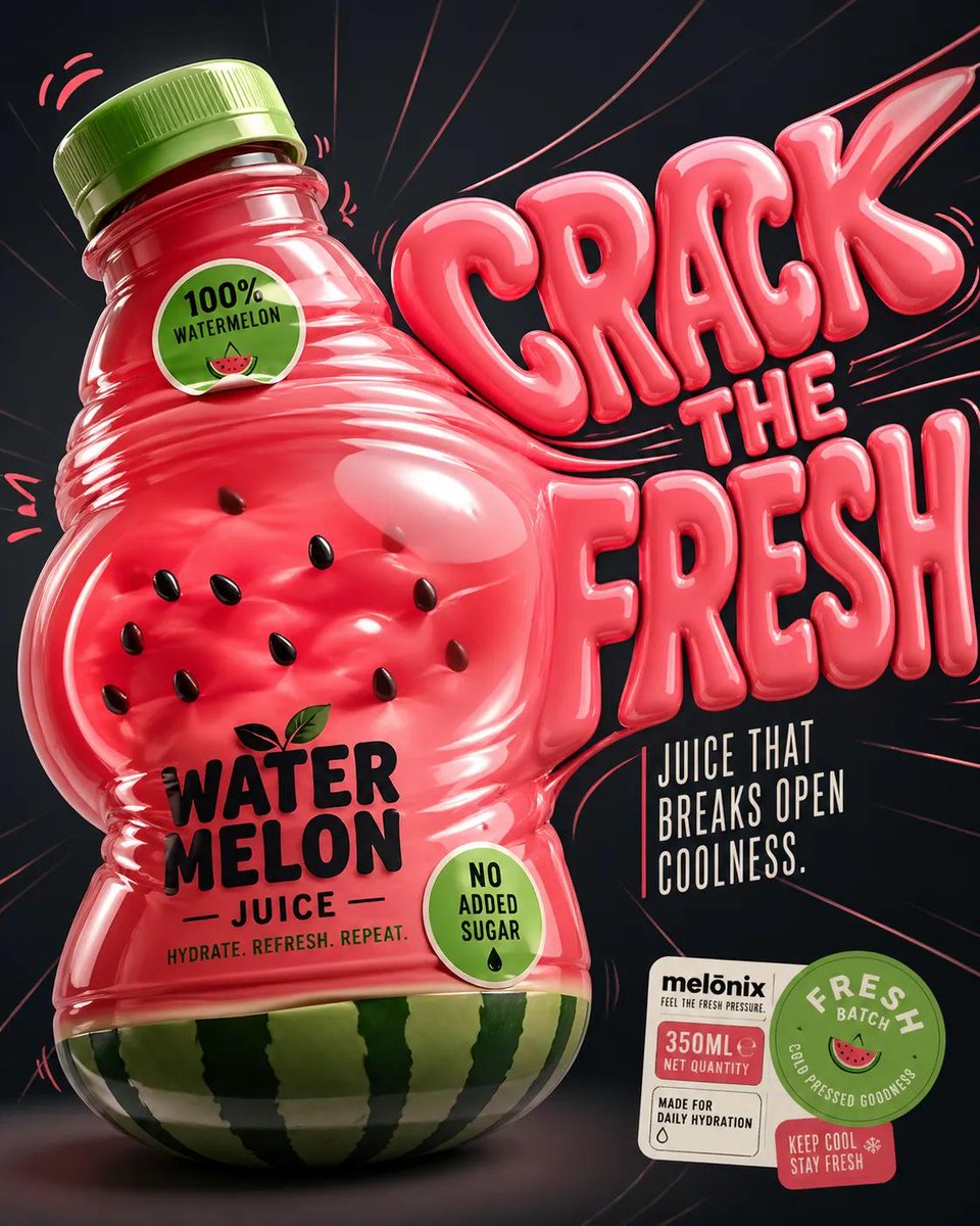
产品视觉 GPT Image 2 提示词:Inflatable Surreal Product Poster
A playful, neo-pop surrealist product poster for juice using inflatable plastic textures and internal pressure distortion effects.
📝 提示词
Design a '4:5' product poster for an '{argument name="fruit" default="orange"}' juice 3d bottle using playful inflatable-plastic packaging surrealism where the bottle behaves like a squeezed toy object mid-pressure. The poster should communicate juiciness, tension, and tactile freshness through a bottle that visibly bulges, stretches, and compresses like a soft object being squeezed from the inside out.
SUBJECT:
A single bottle dominates the center-left, illustrated in a semi-3D stylized form (not photoreal). The bottle is visibly distorted—its midsection bulges outward while the neck is slightly compressed, as if internal juice pressure is pushing against the container walls. The liquid inside exaggerates this effect, forming rounded convex surfaces pressing against the plastic. The cap is slightly tilted from pressure. The bottle feels elastic, alive, and reactive rather than rigid.
COMPOSITION:
The composition mechanic is “internal pressure distortion”. The eye enters through the most inflated part of the bottle (center bulge), then follows curved tension lines outward toward stretched typography on the right side. The camera uses a slightly low, close-up perspective with mild fisheye distortion, amplifying the sense of pressure and expansion. The bottle leans diagonally into the frame as if pushing against invisible resistance. Negative space on the right is intentionally stretched and warped, echoing the bottle’s deformation.
TYPOGRAPHY:
Headline: “{argument name="headline" default="SQUEEZE BACK"}” in thick, rounded, inflated lettering that mimics air-filled plastic. The type is physically distorted—letters stretch horizontally near the bottle and compress toward the edges, as if affected by the same pressure force. The headline sits to the right of the bottle but partially overlaps its bulging edge. Subheadline: “Juice that pushes back.” in a narrow condensed sans, straight and rigid, contrasting the soft headline. Small circular microcopy labels (e.g., “100% organic”, “no added sugar”) appear like printed stickers slightly warped by the surface tension.
LIGHTING / GRAPHIC TREATMENT:
Soft studio lighting adapted for stylized rendering—broad diffused highlights across curved surfaces, subtle specular streaks that follow the deformation. No realistic reflections—only controlled, simplified highlight bands that emphasize volume and elasticity.
COLORS:
'orange' juice bottle color and 3d header text. Small accents of 'bright lime green' for sticker elements. High contrast between glowing orange and dark surroundings.
BACKGROUND:
A smooth dark gradient field with subtle radial tension lines expanding outward from the bottle, like invisible pressure waves. No texture clutter—clean but dynamically warped space.
STYLE:
Neo-pop surreal product illustration with inflatable material logic, playful distortion, and high-impact commercial clarity.
FINISH:
Soft plastic-like rendering, clean edges, controlled gradient transitions, no noise or grain, polis
🎯 适合场景
适合快速搭建产品图、包装展示和品牌海报:主体、材质、背景与商业修图方向已经有框架,换掉变量就能开跑。
💡 改写建议
- 先替换变量里的品类、人物、城市、品牌色,不急着改整段结构。 把主体、构图和风格分开写,后续微调会更稳。