产品展示
界面稿
角色设定
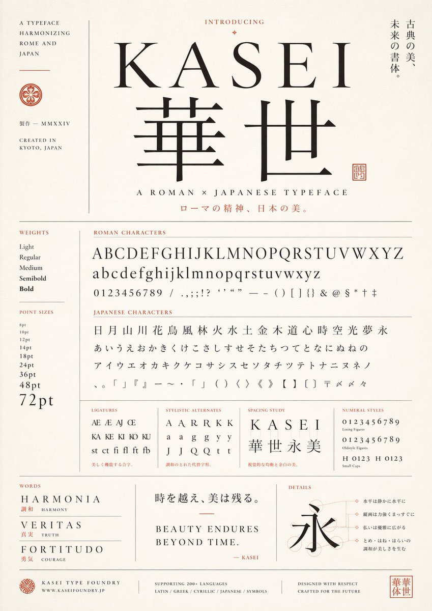
产品视觉 GPT Image 2 提示词:Japanese Roman Typeface Specimen Poster
A sophisticated editorial poster showcasing a fictional bilingual serif typeface, suitable for font presentation, branding mockups, or typographic art prints.
📝 提示词
Create a refined vintage-modern type specimen poster for a fictional typeface named {argument name="typeface name" default="KASEI"}, designed as an elegant fusion of Roman and Japanese typography. Use a tall portrait layout on warm ivory textured paper with thin gray divider lines, black letterforms, and muted vermilion accent text and seals. Center the composition around a large serif Latin wordmark "{argument name="typeface name" default="KASEI"}" above 2 oversized Japanese kanji, "華世", set in a matching high-contrast classical style. Above the title, place the small heading "INTRODUCING" with a tiny ornamental diamond. To the right of the title area, add a vertical Japanese tagline reading "古典の美、未来の書体。". Under the main kanji, add the subtitle "A ROMAN × JAPANESE TYPEFACE" and below it a Japanese line in vermilion: "ローマの精神、日本の美。". On the far left, create a narrow sidebar with the stacked English text "A TYPEFACE HARMONIZING ROME AND JAPAN", a small circular crest, the Japanese text "製作 — MMXXIV", and "CREATED IN KYOTO, JAPAN".
Build the lower two-thirds as a meticulous type specimen sheet with exact labeled sections. In a left column, include 2 sections: "WEIGHTS" with 5 items — Light, Regular, Medium, Semibold, Bold — and "POINT SIZES" with 9 items — 8pt, 10pt, 12pt, 14pt, 18pt, 24pt, 36pt, 48pt, 72pt. In the main area, include a section titled "ROMAN CHARACTERS" showing 4 specimen lines: uppercase alphabet A through Z, lowercase alphabet a through z, numerals 0 through 9, and a punctuation/symbol line with slashes, commas, semicolons, exclamation mark, question marks, apostrophes, quotation marks, em dash, parentheses, brackets, braces, ampersand, at sign, dollar sign, asterisk, dagger, and double dagger. Below that, include a section titled "JAPANESE CHARACTERS" with 4 lines: 19 kanji "日 月 山 川 花 鳥 風 林 火 水 土 金 木 道 心 時 空 光 夢 永", 23 hiragana "あ い う え お か き く け こ さ し す せ そ た ち つ て と な に ぬ ね の", 21 katakana "ア イ ウ エ オ カ キ ク ケ コ サ シ ス セ ソ ン タ チ ツ テ ト ナ ニ ヌ ネ ノ", and a symbols line including Japanese punctuation, corner brackets, wave dash, middle dot, parentheses, angle brackets, double angle brackets, black lenticular brackets, postal mark, reference marks, and iteration mark.
Along the next row, add 4 compact specimen panels: "LIGATURES" with 10 items — Æ, AE, AJ, Œ, KA, KE, KI, KO, KU, and "st ct fi fl ft fb"; "STYLISTIC ALTERNATES" with 12 items — A, A, A, R, R, K, K, a, a, g, g, y, y, J, J, Q, Q, t, t — arranged as a neat sampling grid; "SPACING STUDY" showing the word "KASEI" with wide tracking above the kanji string "華世永美"; and "NUMERAL STYLES" with 4 lines — lining figures 0123456789, oldstyle figures 0123456789, and small caps combinations "H 0123" and "H 0123". Add tiny red Japanese captions beneath some of these sample boxes.
At the bottom, create 3 feature panels. Left panel titled "WORDS" with 3 entries: "HARMONIA" with the red Japanese and English gloss "調和 HARMONY", "VERITAS" with "真実 TRUTH", and "FORTITUDO" with "勇気 COURAGE". Center panel with a large Japanese quote "時を越え、美は残る。" above the English statement "BEAUTY ENDURESnBEYOND TIME." and a small signature line "— KASEI" in red. Right panel titled "DETAILS" with a large kanji "永" over faint construction circles and guide lines, plus 4 right-aligned Japanese annotation callouts connected by fine dotted leader lines.
Finish with a footer containing 4 blocks: a small crest and "KASEI TYPE FOUNDRY" with "WWW.KASEIFOUNDRY.JP"; a centered language support note "SUPPORTING 200+ LANGUAGES" and "LATIN / GREEK / CYRILLIC / JAPANESE / SYMBOLS"; a right-side statement "DESIGNED WITH RESPECTnCRAFTED FOR THE FUTURE"; and a square vermilion seal bearing "華世". Overall style should feel like a premium Japanese foundry specimen sheet, balancing editorial Swiss-grid precision, classical book typography, subtle Japanese branding, generous margins, restrained luxury, and museum-poster elegance.
🎯 适合场景
适合快速搭建产品图、包装展示和品牌海报:主体、材质、背景与商业修图方向已经有框架,换掉变量就能开跑。
💡 改写建议
- 先替换变量里的品类、人物、城市、品牌色,不急着改整段结构。 把主体、构图和风格分开写,后续微调会更稳。