产品展示
信息图
界面稿
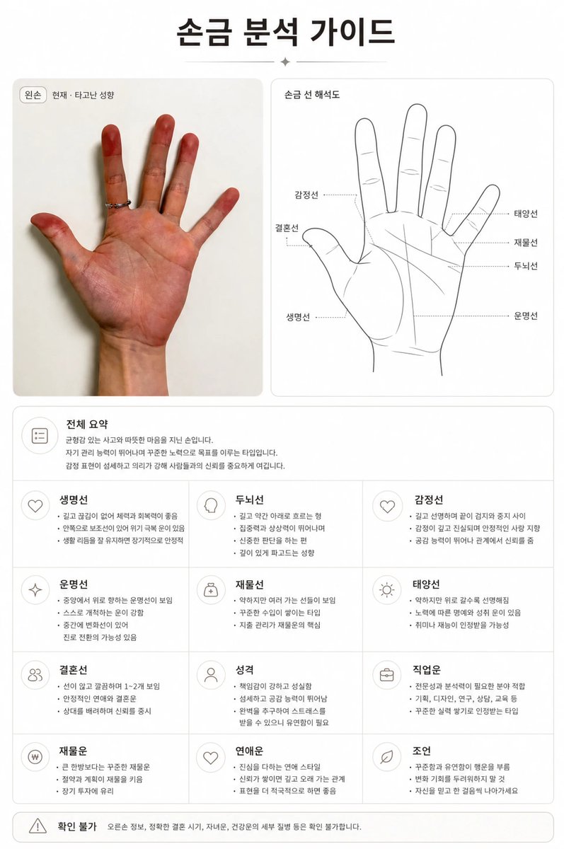
产品视觉 GPT Image 2 提示词:Premium Korean Palm Reading Guide
A highly detailed instruction set for analyzing a hand photo to generate a luxury-style palm reading report in Korean, featuring a two-panel layout with real and diagrammatic views.
📝 提示词
Create a premium Korean palm reading guide image based on the uploaded palm photo.
All visible text in the final image must be Korean only. Use clean Korean sans-serif typography. The title must be exactly “손금 분석 가이드”.
Create a refined two-panel layout:
Left panel: place the uploaded real palm photo inside a clean rounded card. Preserve the original hand shape, palm lines, skin texture, and natural details. Do not distort or redraw the hand.
Right panel: create a separate black-and-white palm contour interpretation diagram based on the same hand. Highlight the main palm lines with thin precise lines and label them in Korean.
Include Korean labels and sections:
“손금 분석 가이드”, “전체 요약”, “생명선”, “두뇌선”, “감정선”, “운명선”, “재물선”, “태양선”, “결혼선”, “성격”, “직업운”, “재물운”, “연애운”, “조언”, “확인 불가”.
Analyze palm shape, finger proportions, life line, head line, heart line, fate line, wealth line, sun line, marriage line, line depth, length, direction, breaks, branches, and overlaps. If something is unclear, write “확인 불가”. Keep the Korean interpretation short, realistic, calm, and advisory.
Design style:
1:1 square format, white background, black and warm dark gray text, thin hairline dividers, rounded cards, subtle shadows, large margins, generous negative space, precise grid, minimal line pictograms, luxury editorial report, high-end wellness analysis, elegant and expensive-looking.
No English text, no roman letters, no broken Korean, no random glyphs, no colorful decoration, no cartoon style, no occult symbols, no tarot imagery, no horror mood, no messy background, no watermark.
🎯 适合场景
适合快速搭建产品图、包装展示和品牌海报:主体、材质、背景与商业修图方向已经有框架,换掉变量就能开跑。
💡 改写建议
- 先替换变量里的品类、人物、城市、品牌色,不急着改整段结构。 把主体、构图和风格分开写,后续微调会更稳。